case study
Namastetics
services
Brand Strategy, Brand Design, Packaging Design
The Challenge
Namastetics, a soulful activewear brand focused on ethically made, high-quality apparel for conscious women, came to us ahead of the launch of a new product line. While their clothing was beautifully designed—comfortable, flattering, and planet-friendly—their existing DIY branding wasn’t reflecting the quality, intention, or emotional experience of the products themselves.
They were looking for a brand identity that felt iconic, refined, and elevated—something that would immediately feel like the garments: fluid, feminine, grounded, and intentional.
The Solution
We reimagined Namastetics’ identity around the ideas of movement, flow, and presence—core to both yoga and conscious living. After exploring several directions, we landed on a refined wordmark featuring a swooping “N” that subtly evokes motion and breath. Designed to work both independently and alongside the full wordmark, the “N” became an iconic symbol for use across apparel and packaging.
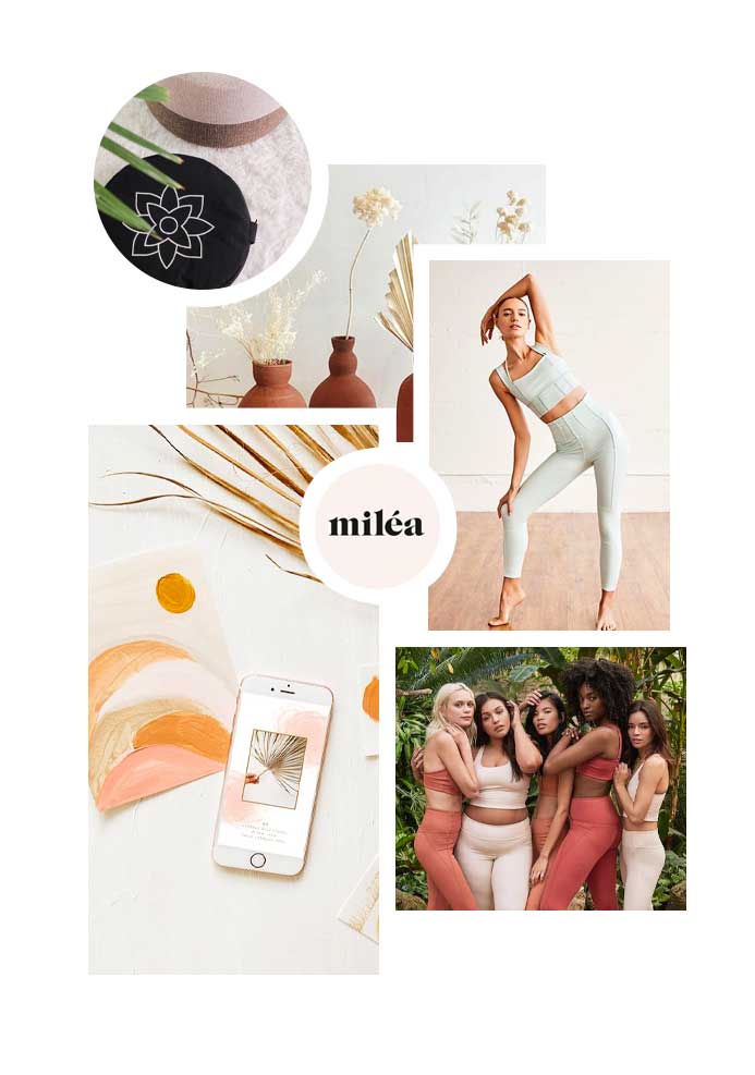
We paired the logo with a calm, expressive pastel palette and bold, modern typography, striking a balance between softness and strength. The refreshed identity was carried through all packaging, including biodegradable mailer bags, as well as website banners and promotional materials—creating a cohesive, elevated brand experience that reflects the quality, intention, and soul of the products themselves.

inspiration and concepts